These notes build up to the use of a chi-squared test to see if results from a simple breeding experiment with fruit flies are consistent with predictions based on Mendelian genetics.
The Flash animation above was converted from an MS PowerPoint presentation file by importing the presentation into OpenOffice 2.01 on the Mac, and then exporting as a Flash swf file. Embedding HTML was adapted from a previous animation – just view the source of this page to get an idea of what is involved.
To use the animation, just click with your mouse over the yellow area – space bar won’t work. You can download the SWF file if it is of any use to you – just right-click (or apple-click) over the previous link to download the SWF file to your desktop. Dragging the SWF file into a Web browser will start the animation. My next move is to see how good the Flash export from Apple Keynote is – the OpenOffice export is basic to say the least, no transitions, and it can’t export ‘custom animations’. I had to produce the ‘builds’ in the animation by copying slides and deleting elements in reverse order…
Logitech USB microphone – about £12 from Dixons, Belkin make looks the same
Audacity sound editing software with the Lame Mp3 library for MP3 export
A script in TextEdit
I can’t speak without a script as I’m uming and ahhing too much if I make the words up as I go along. The mp3 file linked here was the second take, with some tweaking of the text. Audacity settings were as follows…
22050 samples per second sample rate
MP3 export set in preferences to 48Kb rate (half the lowest quality for music mp3 players)
I set an FFT filter to cut the treble after about 8 kHz to remove the ‘sibilants’
I used the ‘normalise’ filter to bring the peak level up to -3db, the Logitech microphone is not the most sensitive and the default recording levels are a bit low
The script is posted below the fold of this blog post. I’d appreciate any feedback about difficulties in playing the 48Kb/s mp3 file.
“Long before there was “death-by-PowerPoint,” there were bad presentations. Really bad presentations. So don’t blame the software or Microsoft; the genesis of painfully dull presentations predates the computer. ”
Garr Reynolds on Presentation Zen blog
While I would not go as far as Jay H Lehr suggested in his paper called Let there be stoning , there is no excuse for ‘death by PowerPoint’ in the education business.
We as teachers are allowed to do things like run MS PowerPoint in authoring mode on the projector and invite our students to add views or make comments – interaction might help them understand and gives us feedback on the quality of understanding. Lessons are scheduled each week so we can load up what was said last week and review material. We as teachers perhaps need to see PowerPoint as part of a sequence of lessons and use it more like a diary or record than the typical Dilbertian executive.
Garr Reynolds’ Presentation Zen blog is aimed at people who sell things – and who give a presentation to a large , skeptical audience once. His most recent article suggests having a spare computer or using a photo capable iPod as a reserve backup with slides popped on as photo images. I like the idea of printing PowerPoints to PDF format and showing the PDF from any local PC that can be found.
Mac OS X Tiger comes with a number of basic applications including Grab, Preview and Grapher. Preview is the built in PDF file viewer. It is small, quick and simple to use as a PDF viewer, but as Mac OS X uses the PDF file type for printing and for describing the screen contents, preview has a few more tricks up its sleeve.
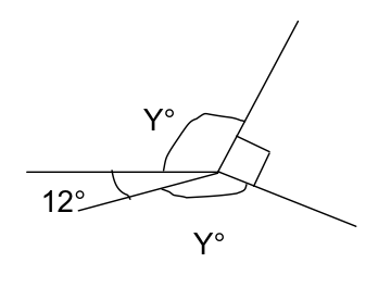
The diagram above was produced in Word 2004 as part of a simple worksheet – I often have students doing three or four questions about last week’s work at the beginning of a lesson as a kind of starter, the problems are chosen to point towards this week’s work. This helps soak up the varied arrival times of students, especially in a workshop period at the start of the College day.
In Word, I printed the worksheet as a PDF file (Mac OS X can produce PDF files from any application). Then I viewed the PDF file in Preview. To cut the diagram out, I just
Clicked on the Select tool in the tool bar
Dragged a box around the diagram – the rest of the page turns dark grey and the selected area remains white. Handles allow resizing the selection
Clicked Edit | Copy in the Preview menu (or apple-c)
Selected File | New From Clipboard in the Preview File menu
A new Preview window appears with just the diagram
Select File | Save As from the Preview File menu
Set the file type to GIF, JPG or PNG (or indeed EPS or PDF for re-import into a drawing program)
The results can be seen above. Just what you need to keep the class blog rolling…
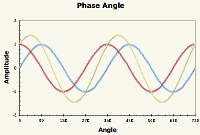
You can use a simple MS Excel spreadsheet to illustrate the effect of adding two sine waves with various amounts of phase shift between the waves. Using a scroll bar allows a degree of interaction, although the way the scroll bar control works in MS Excel is not good for interactive graphs – you have to adjust the slider and let go before the spreadsheet recalculates to show the effect of the change.
The blue trace is the original sine wave, the red trace is the phase shifted sine wave (both of amplitude 1) and the yellow trace is the superposition of the two waves. The graph extends over two cycles (720 degrees) and the phase shift slider allows phase shifts between 0 and 360 degrees. Rescaling the spreadsheet for Radians would be the work of minutes.