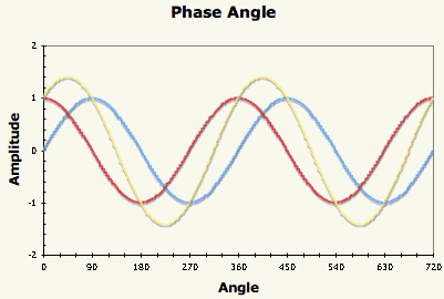
Superposition of two sine waves
You can use a simple MS Excel spreadsheet to illustrate the effect of adding two sine waves with various amounts of phase shift between the waves. Using a scroll bar allows a degree of interaction, although the way the scroll bar control works in MS Excel is not good for interactive graphs – you have to adjust the slider and let go before the spreadsheet recalculates to show the effect of the change.
- Download the MS Excel spreadsheet 148 Kb, Excel 2004 but compatible with Excel 1997+
- FERL video by Alistair McNaught on how to link a scroll bar to a cell value in Excel
The blue trace is the original sine wave, the red trace is the phase shifted sine wave (both of amplitude 1) and the yellow trace is the superposition of the two waves. The graph extends over two cycles (720 degrees) and the phase shift slider allows phase shifts between 0 and 360 degrees. Rescaling the spreadsheet for Radians would be the work of minutes.