Sage or guide?

May 13th, 2007

I’m both in different parts of the lesson. I think that many people assume that PowerPoint use implies Sage role, and I was trying to provide counterexamples.

Charles Nelson takes me to task in my post about PowerPoint in a post on his Explorations in Learning blog as follows

“One point that needs to be considered a little more is Burnett’s preference for Guide on the Side as opposed to Sage on the Stage. This is a common refrain based on the belief that students constructing knowledge from the ground up results in better learning.”

I can reassure Nelson that no group of adult students ‘constructs’ basic Numeracy ‘from the ground up’. They need teaching.

Later, Nelson quotes from an interview with John Sweller, the interview that led to the recent discussions of the ‘cognitive load’ that PowerPoint presentations place on ‘working memory’...

“Looking at an already solved problem reduces the working memory load and allows you to learn. It means the next time you come across a problem like that, you have a better chance at solving it,” Professor Sweller said.

The working memory was only effective in juggling two or three tasks at the same time, retaining them for a few seconds. When too many mental tasks were taken on some things were forgotten.


I can again reassure Nelson that no group of adult students ‘constructs’ basic Maths without being shown examples. Huge numbers of examples! Examples that are carefully chosen to bring out edge cases and contrasts. The examples can be worked through in Sage mode, and then students can see problems with solutions in their textbook. I do spend some time at the beginning of the year in Guide mode getting students to use their Maths textbook effectively.

Perhaps I need to explain the context of my Classroom in a College in a bit more detail. A typical Maths lesson at Level 2 (GCSE level, what we expect about 60% of 16 year olds to be able to do by the time they leave school) would be structured something like this…

  1. Explaining the basic principles – PowerPoint slides but with visuals using what Sweller would call ‘integrated diagram and text’ (see later)
  2. Examples of problems that use the principles, worked through by me with directed questions to students – a range of examples falling into different categories. Clever use of good visuals here can help.
  3. Whole group questions to ensure that students understand the differences between the categories
  4. Individual work on problems that get harder – involve more steps for the student to do – as they complete the work sheet
  5. Some group work; often ‘marking’ made up answers to questions that show common errors. Students work in pairs to find what is wrong and write a sentence or two explaining what the error is and how to correct the mistake. This is unashamedly a Guide activity and it works better than me explaining common mistakes. However by this phase of the lesson, the material is not ‘new’ to the student any more.
  6. Plenary where I summarise and present a couple of exam questions – whole class questions to make steps in the solution clear
A long session (don’t get me started on the timetabling of Maths classes in Colleges) may result in going around the cycle several times within the lesson. Steps 4 and 5 will take around 60% of the time for each cycle as students need to explore the application of the principles to the problems for themselves, with me acting as the Guide. This is the part of the lesson where I can ensure that students are all working in the ‘zone of proximal development’ – some students need more easy examples, others will be working on collections of exam questions. There is a lot of feedback going on in this section of the lesson, as well as individual target setting. The other 40% of the time is definitely delivered and managed in Sage mode, but with enough interaction that the students stay awake and make some decent notes [ seems to be working as I mark some past paper sets today ].

Charles Nelson describes this lesson stucture well

In other words, this research indicates that in learning something new, it’s better for teachers to act as Sages who present examples of “already solved problems.” After a problem or process been learned and students are moving towards mastery of that area, then the role switches to Guide.

I think there may be a difference in the time scale that is needed in different subjects and when teaching different levels. In the Maths lesson described above, we proceed from Sage to Guide stages very quickly. Perhaps Nelson’s work requires a much longer time scale (calendar rather than clock). Another issue is the ‘newness’ of the material I am teaching. Alas, many of my students are only too familiar with basic Maths – or more accurately failing at basic Maths. This raises motivational and confidence issues that tend to influence lesson design.

Sweller’s visualisation work

“It is effective to speak to a diagram, because it presents information in a different form. But it is not effective to speak the same words that are written, because it is putting too much load on the mind and decreases your ability to understand what is being presented.” – John Sweller

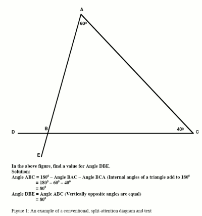
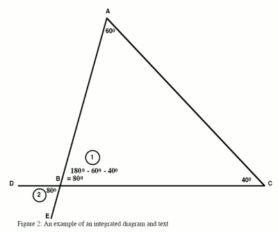
I am delighted to find that Professor Sweller uses examples taken from geometry questions found in Maths textbooks to show how visual and auditory processing can interfere and increase cognitive load instead of working together. Below are two diagrams taken from the paper Visualisation and Instructional Design. A good range of Sweller’s work is available online in PDF format.

The first diagram below shows what Sweller refers to as ‘split attention’ labelling of a diagram. Alas, this is typical of most exam papers at present.


Below is the version that Sweller suggests will reduce cognitive load.


A nice example and one that I will bear in mind! Many of Sweller’s examples are like this: micro scale rather than macro; minutes rather than weeks. His concern is with working memory, so perhaps once schemas form the immense processing capacity of long term memory comes into play.

PowerPoint Big Question

May 12th, 2007

What is appropriate, when and why?

Voting slide used with symbols printed large on A4 sheet given to students - idea from Richard Treves

The Learning Circuits blog has posed this question about PowerPoint, with some detailed side questions. My answers below. See also Clive Shepherd’s answer on his Clive on Learning blog. I like the example slides put up by Jay Cross, especially the little chap ‘reading’ a technical manual upside down!

In lessons in a College

MS Powerpoint can be a teaching tool if used in an interactive and inclusive way. I agree with Shilpa Patwardhan’s post to the Big Question topic in that I think PowerPoint is used too much as a routine presentation tool that replaces interactive activities and reinforces Sage on the Stage roles [ clarification in a later post ]. I try to me more of a Guide on the Side, but I’m aware that I can slip back to Sage on the Stage quite easily, especially given the layout of most classrooms with projectors. I think that might be why Shilpa’s boss banned the use of PowerPoint, he wanted to ensure a more interactive form of training.

I tend not to use the built in templates and I avoid using too much text. Bullet points that echo exactly what is said, together with a handout printed from the PowerPoint as 6 small images per page, are strongly depreciated in my sessions for staff. I also discourage blue text on blue backgrounds and TEXT IN CAPITALS, and those text animation effects… and why do people put logos on every slide at conferences?

Just some bullet points (sic)

  • The most important button is the Escape key. I use PowerPoint slides with tables with blank spaces for students to provide answers. I save these and pull them back on future occasions. You can use Slide Sorter view to get students sequencing the ideas they brainstorm. Involve group members in the writing of the slides.
  • Activity briefs: during group work, I have a slide summarising the current group activity and time allowances on the projector. Saves paper and keeps people on task. Dave Foord’s timeline stopwatches are a feature I’d like to try next year. I call this a ‘guide on the side’ use of PowerPoint. The slide at the front reminding about the goals and time allocation cuts task clarification questions and allows me to sit for longer with groups that need more input.
  • Quick whole class exercises – I have PowerPoint slides with mixed examples of e.g. right angled triangles and students have to solve the problems. Students then use Jim Judges’ famous low tech student wipe boards (plastic wipe off note boards in A4 size with OHP pens) to write answers and show me. I get a quick check of learning (the slide has some easy questions and some harder problems, seats are in a U shape)
  • Voting slidesstudents can vote using a ‘voting slip’ in response to a question on a PowerPoint slide. I’ve used this on management away days to get quick statistics
  • Mind maps and bubble diagrams can be drawn using the ‘connectors’ and you can reveal richer connections by having a series of slides that build up. Drawing in class is too slow, so I do prepare these in advance. I have hyperlinked from a boxes in a mind map to a slide with more information about that topic and given the students the choice of how to ‘navigate’ the presentation.
  • Builds in diagrams – Graphs and geometry. I must admit that I use Excel and Geometry Applet java pages more for this
  • Photos of a procedure – just a series of still photos of key points when students are doing an experiment in a lab session. Show the sequence to evening students before they do the same experiment (they get less chances to do lab work). Result: everyone knows what the equipment looks like
  • Handouts must be designed for use – I don’t use the ‘handout’ view in PowerPoint. I tend to have a copy of a diagram with spaces for labels, or a table with general points in one column and spaces for students to summarise the discussion in the other.

Other uses

  • Basic multimedia authoring. Use PowerPoint in Kiosk mode and set up ‘action buttons’. Students can pull packages – perhaps photos of a procedure with a sound track -  off the Intranet for private study.
  • Screen casting – see my YouTubes. I’m using sparse and simple slides for YouTube based screencasts because 320 by 240 pixels is not a lot of space

Similar triangles for YouTube first slide in sequence Slide as part of a sequence for a YouTube screen cast. Handy for interactive whiteboards.

When not to use

  • When there is little visual material to cover
  • When it is a revision and practice session; right now I’m working with past paper questions chosen to bring out teaching points. Students are sitting cafe style around tables
  • More than 25% of a lesson generally speaking, although the projector may be left on for the whole lesson showing activity slides or reminders
  • When you are tempted to read out the slides!
I shall post some example PowerPoints next week.

Test from ScribeFire

May 12th, 2007

Testing the ScribeFire blog tool, a plugin for Firefox. You can post to blog directly from Firefox, and you can upload pictures using the WordPress image upload script.

The HTML produced by the rich text editor is familiar to Firefox and Mozilla users, full of line break tags. At present, there appears to be no way to add an ‘excerpt’ to the post from the editor window – the Bodmas Bridgit layout works better with custom excerpts. If you do not add an excerpt, WordPress takes the first 120 words of the post as the excerpt and that is a little long for the Bridgit layout. I have found a WordPress plug-in that alters the excerpt behaviour, see below.

For a blog running the default layout, I can imagine ScribeFire being useful. Bear in mind that the plug-in is purely a posting tool – you can’t edit posts or manage other aspects of the blog unlike (say) Ecto for the Mac OS X platform. There is no local storage of past posts.

When configuring ScribeFire for use with a WordPress blog on your own server, you need to

  • Start the Account Wizard
  • Select Custom Blog from the drop down list
  • Select WordPress from the list of blogging servers
  • Correct the Web address of the posting script to that used on your server
  • Fill in your user name and password

Then I would suggest you post a test post with a small image – so you can get the image upload settings added to the account…

  • Click the image upload button in the editor
  • Check the Image Upload check box (from URL is the default)
  • Browse for your image file
  • Click the Upload via API button

Your image is uploaded, and the Web address of the image is displayed. Clicking the Insert Image button drops the image tag into the rich text editor.

The Semilogic Fancy Excerpts WordPress plug-in works with WordPress v1.5 and allows you to specify a character limit for excerpts within the php code (I’ve set the one for bridgit to 50 characters). The plug in will then chop the first one or two complete sentences closest to that limit and display those wherever the ‘excerpt’ tag appears in your template. A ‘feature’ of the plug-in is that the excerpt behaviour is not changed on trackbacks or on RSS feeds. Some will see that as a bug.

History

May 9th, 2007

A demo of someone using a mouse to edit a sentence of text projected huge on the screen with commentary. Very straight- a demo in front of 1000 computer types in December 1968 – but possibly more revolutionary than a lot of what was going on in the streets then. I was especially struck by the demo of simple text editing coupled with the idea of ‘jumping’ to other documents.

The sound track has a strange quality probably because of the echo from the PA system in the hall and because of the beeps and tones the primitive computer terminal (already connected by a network to a remote server) was making.

Jay Cross has collected a range of important books that have influenced thinking about learning and the network, and the graphical user interface is central to our current use of computers.

I’d add a few in as follows

More Maths materials soon – I’m working on the trigonometry YouTube and the simultaneous equation Hot Potatoes quiz.

Blogging to teachers

May 6th, 2007

i3 venn diagram

i3, teaching in the age of the Web is a blog that I am using to contact teachers on various campusses (campii?) before a staff development event. I want to ask about barriers and to get some information about specific needs in certain curriculum areas of the section I work in. It cost £40 for a year’s hosting, two years domain registration and VAT, and I had the WordPress based blog and a customised theme in place in a couple of hours. This is a personal project, using a blog with teachers in the same way that I have used a blog to support GCSE Maths students. I hope the teachers are a little more interactive than the GCSE Students!

I know from capital requests (it is the season of business plans and spreadsheets) that interactive whiteboards are in demand. I want to publish some good practice on interactive whiteboard use and to find ‘friends’ for each of the boards we will install.

Inform, include, interact came from three ‘dimensions’ or ways of working with Moodle that Alan Staley identified (he uses different words, but the idea of a scale or diagram to encourage teachers to ‘score’ their use of a VLE is his).

The U word

May 1st, 2007

you cant see understanding from a brain scan yet...

We have all been writing assessment criteria for a newly validated Access course. When framing the wording of criteria, people turn to examples from other sources including the relevant A level syllabus and BTEC National Diploma units. The word ‘understand’ often appears in these published sources, but is rejected by the Access subject experts.

I think the subject experts are right to balk at the U word. You can’t use a brain scan to ‘see’ if someone understands the straight line graph. I see ‘understanding’ as what we are aiming at, but, like a strange disease, it has to be identified by symptoms. The symptoms of understanding will be different for different subjects, and that is where I begin to disagree with those subject experts appointed by the validation panels.

Benjamin Bloom’s taxonomy of learning objectives in the cognitive domain is often used as a source of words to frame objectives or criteria. Bloom provides what are termed ‘question cues’ for each of the 6 levels of the taxonomy as follows…

  • Knowledge: list, define, tell, describe, identify, show, label, collect, examine, tabulate, quote, name, who, when, where
  • Comprehension: summarize, describe, interpret, contrast, predict, associate, distinguish, estimate, differentiate, discuss, extend
  • Application: apply, demonstrate, calculate, complete, illustrate, show, solve, examine, modify, relate, change, classify, experiment, discover
  • Analysis: analyze, separate, order, explain, connect, classify, arrange, divide, compare, select, explain, infer
  • Synthesis: combine, integrate, modify, rearrange, substitute, plan, create, design, invent, what if?, compose, formulate, prepare, generalize, rewrite
  • Evaluation: assess, decide, rank, grade, test, measure, recommend, convince, select, judge, explain, discriminate, support, conclude, compare, summarize

These ‘question cue’ words can be used to describe most of the ‘symptoms’ of understanding a given topic I think. My problem is the allocation of levels in Bloom’s taxonomy to levels of qualification. As far as we can second guess things, we suspect that the scheme goes something like this…

  • Level 1: Knowledge, comprehension
  • Level 2: Application, analysis
  • Level 3: Synthesis, evaluation

Worse than this crude and, I think, false allocation of qualification levels to levels in the taxonomy is the requirement that an assessment unit written at level 3 should only contain level 3 assessment criteria. As the student must show evidence of achievement of all criteria in a unit to achieve that unit, then surely as long as there are some or a a majority of outcomes at level 3, then that must be regarded as a level 3 unit.

As I argued above, the symptoms (or behaviour of the student) that we use to infer understanding must be relevant to the subject area under discussion. Gas fitters must be competent as tragedy ensues if they are not. Level 3 and 4 Gas Installation qualifications therefore stress knowledge and application and they must continue to do so, as must qualifications for eye surgeons and dentists.

Science subjects including maths differentiate by topic. If you know harder topics, and can demonstrate that knowledge by stating and describing and explaining and listing, then you are working at a higher level than another person who can state, describe, explain and list easier things. The level of an assessment unit should be defined by the topics covered rather than the cue words, although cue words should still be chosen carefully to clarify what behaviour the student should exhibit in order to allow us to diagnose understanding. Science teachers must explain new harder topics and link these to existing knowledge, they must provide hooks and analogies and challenge with puzzles and patterns.

I suspect that the allocation of qualification levels to the taxonomic levels of Bloom occurred in the humanities subjects. These humanities subjects differentiate by student response to task. For example the whole class can write an essay on Freud for 90 minutes and every single student can file out of their exam having completed the task and felt successful. The teacher must then grade the quality of the responses, and the symptoms of understanding of Freud’s psychology may well involve an ability to compare, contrast and make judgments. A student who describes and lists may not be displaying the symptoms that define the sophistication of understanding needed for the qualification. The tutor must then give feedback to the student who is listing and describing, and that feedback must enable the student to move up the levels in Bloom’s taxonomy without crushing the student. There lies an important aspect of the role of humanities teacher.

Subject experts, please, have regard to the ‘community of practice’ in your subject! Don’t fall for the crude mapping of Bloom’s taxonomic level to the level of the qualification, but you are right to demand a full description of the behaviour that tells us that a student ‘understands’.

Trig summary sheet

April 29th, 2007

You can download a one side summary of the Trig formulas, including the SOH-CAH-TOA reminder. [ 110 Kb, PDF ]

GCSE Maths students find the trigonometry problems hard, and I think this is because such problems involve a range of skills like

  • Identify what you know in the question
  • Decide if it is Pythagoras or Trig
  • Identify the ratio to use
  • Transpose the formula to get the correct calculation
  • Manipulate the calculator to find either the side (sin(known angle)) or the angle (shift-sin(answer to calculation))

I’m working on a flow chart that will guide students through these choices in the right order. If a student narrows down incorrectly, say trying to use the Sin formula in a problem that involves the opposite and the adjacent sides, then s/he will have to backtrack wasting time and causing confusion.

I’m also working on four YouTubes (Basics and Tan function, Sine function, Cosine function, Mixed problems and identifying the correct route). This will then form the basis of my teaching in future years, lets face it trigonometry has not changed for a millennium or two!

There is an excellent handout with problem sets that you can download from the Centre for Innovation in Mathematics page about the Mathematics Enhancement Programme materials for GCSE Maths. You are looking for the trigonometry link in the Units 1 to 6 Standard/Academic Practice book.