December 7th, 2005
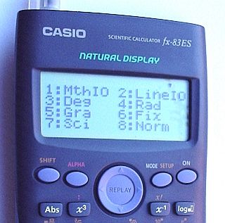
The Casio fx-83ES calculator is currently on sale in WH Smiths, Sainsbury’s and other outlets as ‘the GCSE’ calculator. The machine has a shed load of features, and it brings the use of a ‘natural’ notation further in calculator input.
The calculator has different ‘IO modes’ so that the input and output can be configured. The calculator is in mathIO by default, so that 1 ÷ 3 gives the fraction a third as the answer, and 10 × √ 162 gives the answer 90√2 !
The work round is to press SHIFT MODE 2 to put the calculator in a decimal mode. This mode is called lineIO – I suppose the ‘line’ comes from the idea of decimal numbers on a single line. Shift-mode 3 also puts the calculator into Degrees mode (I have noticed a couple working in grads).
While I can understand the desire to show off the capabilities of this calculator, I do think that setting surd/fractions format as the default mode is a little off-putting for new users.
Posted in Maths | Comments Off
December 4th, 2005
The graphics look great – I’m waiting for Celestia to download now (the joys of a modem – soon to be DSL broadband). I’ll still use Xephem for serious calculation and post script sky charts.
Posted in Notes | Comments Off
December 4th, 2005
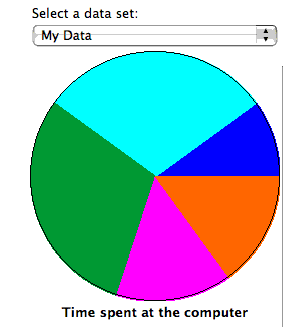
Both GCSE and Access Maths are moving into basic charts – and there is also coursework that requires students to write about what the graphs mean. I had a laptop and projector set up with Excel running. I typed in some data for a pie chart – and used the Chart Wizard to draw the chart. The students drew a chart based on the same data and compared their drawings with the projected image – caught a few mistakes that way while I went around and helped position the protractors.
Then I asked questions about the relative sizes of the sectors – is this sector twice the size of that one or nearer three times the size? – Which sector is the largest? How big is the second largest in relation to the largest; half the size? a quarter of the size? Guess the percentages in each sector! Finally, I had data with two columns and asked students to compare the relative proportions or percentages of each sector. I then used the Chart Wizard to redraw the graphs as a comparative percentage bar chart – much easier!
All this could have been accomplished with handouts, OHPs, PowerPoint presentations or sketches on the whiteboard but using Excel interactively saved a shed load of time and allowed me to alter the data on the fly and answer questions with examples.
The Shodor Foundation makes a range of interactive Java applets available for use from their Web server (no download for Intranets alas)
Posted in ILT, Maths | Comments Off
December 3rd, 2005
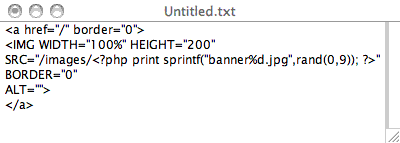
A page with all the current banners can be found at http://www.bodmas.org/banners/
My current home-made theme for this page is a very simple table based layout ripped off from Sunir Shah’s home page. As I personally prefer to edit php code in Text Wrangler on the computer rather than a poky textarea box within WordPress, all the php code for the site is in one index.php file. A minimal style sheet specifies preferred fonts and link styles and contains the text headers that the wordPress themes system needs.
If you reload the page, you should see a randomly chosen banner picture – one of 10 choices at present, with more to come later. The code snippet at the top of this post explains how this stunningly unoriginal trick works. I have 10 banner files in the site images file, named banner0.jpg, banner1.jpg and so on up to banner9.jpg. The rand(a, b) function in php returns a random integer between a and b. The sprintf() function in php allows us to build a file name based on the random number using a syntax familiar from C hacking. I guess the same effect could be achieved using client side scripting in Javascript.
I have had the impudence to name this theme (which will be packaged for release soon, with the banners in a folder within the theme folder as they should be) after Dr Gonzo of Fear and Loathing in Los Angeles fame as the theme is not XHTML compliant and does not use CSS for layout. The theme is cheap and cheerful and it got the job done quickly.
We had a good time finding images suitable for cropping for themes. They are all 800 by 200 pixels in size. I have used the old trick of setting the image width to 100% so that the image will always span the available browser window. If you alter the width of the browser window so that the image looks ‘right’, then you will have a browser set to roughly the width that these pages were designed for.
Web design students have to cope with course specifications that are a few years out of date – a Foundation degree Web Authoring module specification demands the use of ‘nested table based layouts’ for full marks! This theme may help a little.
Posted in Web | Comments Off
November 30th, 2005
Christopher Alexander is a mathematician, visionary architect and philosopher. One of his better known articles A City is not a Tree has had a strong influence on thinking about cities and planning. This kind of thinking links with David Kolb’s essay on sprawling spaces – strange how computer scientists and programmers find this spatial thinking so important.
See also A Pattern Language which must have launched a thousand Objects.
“We begin with that part of the language which defines a town or community. These patterns can never be “designed” or “built” in one fell swoop- but patient piecemeal growth, designed in such a way that every individual act is always helping to create or generate these larger global patterns, will, slowly and surely, over the years, make a community that has these global patterns in it.”
See also the
Patternlanguage wiki
Posted in Maths | Comments Off
November 30th, 2005
“What happens is that as Arctic ice melts and Arctic rivers flow faster – trends which have both been documented – the northern oceans become less saline.
Less salinity means a lower density; the waters then cannot sink, so the conveyor weakens.
Computer models have predicted that if it turned off completely, Europe would cool by perhaps four to six degrees Celsius.” – BBC article about the Rapid project
This matters as we are looking at the Golden Nuclear Goose again…
Posted in Notes | Comments Off
November 26th, 2005
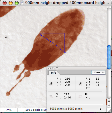
See a previous post on simulated blood stains for the context of this experiment. we are testing the validity of the formula θ = sin-1(w/l) where l and w are the length and width of an ellipse fitted to a blood stain.
- Set Preferences -> Units & Rulers from the Photoshop preferences menu
- Open the info swatch by selecting Window -> info from the Photoshop Window menu
- The info swatch follow you mouse and shows the current screen coordinates relative to the top left of the image
- Dragging a line or Arrow Pointer (latter on Photoshop not Elements) will show the width and height of the distance moved from the starting point
- In effect, you get the X and Y coordinates of the two points on the width of the simulated blood stain
- Use Pythagoras to get width: width = √(W2 + H2) where the W and H are read from the info swatch
Scanning direct from the simulated bood stains (paper in a plastic wallet to protect the scanner!) at 1200 dpi gives many hundred pixels on the width measurement, thus errors better than a vernier caliper.
Posted in Forensic, Maths | Comments Off