Cumulative frequency screencast

December 14th, 2006

The YouTube video above explains the idea of cumulative frequency. It is the first fully scripted screencast, and I think it sounds like it is being read out! I’m going back to the cue card idea and extemporising around the slides I think.

This screencast is aimed at GCSE Maths students working at intermediate level on the data handling module of a modular GCSE. I have left out questions like “what percentage of the seedlings where greater than 50 mm in height” and I have used intervals that make finding the upper class boundary easy. Both of these points will need to be explored in a handout and in revision sessions.

The script

This screencast assumes that you know what a grouped frequency distribution is, and that you are familiar with terms like range and median.

Slide 1: I will show how to find the cumulative frequencies from a frequency table and plot these against the upper class boundary for each interval in the table. Then I will use the cumulative frequency curve to find the median and the upper and lower quartiles. Finally, I will calculate the inter-quartile range and explain what the IQR tells you about the distribution.

Slide 2: The cumulative frequency is a running total of the frequency. Lets look as some example data…

Slide 3: This frequency table shows the results from some cress seedlings grown on soil. To find the cumulative frequencies just..

Slide 4: ...add a row for the cumulative frequencies…

Slide 5: The first cumulative frequency is seven..

Slide 6: The next cumulative frequency is seven plus twelve giving nineteen

Slide 7: and then the next cumulative frequency is seven plus twelve plus fifteen giving thirty four. You can add the fifteen in the third column to the cumulative frequency in the previous column, nineteen, to get the same result…

Slide 8: and finally just add three to the thirtyfour to get thirty seven. So now you have all the cumulative frequencies. The last cumulative frequency should be the total of the frequencies as a check.

Slide 9: Next we need to identify the upper class boundaries for the frequency diagram. These are what we plot the cumulative frequencies against.

Slide 10: The upper class boundary of the first interval is the largest value that can be allocated to the first interval.

Slide 11: Because of the way we have written the intervals, forty five is the largest value in the first interval.

Slide 12: fifty is the upper class interval for the second interval….

Slide 13: ... and fifty-five for the third…

Slide 14: .... and sixty for the last interval. Other ways of writing the intervals can make it harder to find the upper class boundaries – there are some examples in the handout.

Slide 15: ...Now we need to plot the cumulative frequency against the upper class boundaries
Slide 16: The data we are plotting looks like this (you don’t need to draw a new table when you are doing exam questions). The upper class boundary is plotted on the horizontal axis and the cumulative frequency on the vertical axis

Slide 17: A suitable graph scale might look like this. You plot each point just as you would on a scatter diagram.

Slide 18: To plot the first point, go along to 45mm on the horizontal axis and up to 7 on the vertical axis. I’m using huge blobs for clarity, you would be using small neat crosses!

Slide 19: along to 50mm and up to 19…

Slide 20: along to 55mm and up to 34…

Slide 21: along to 60mm and up to 37..

Slide 22: and then we add a point at forty mm and zero cumulative frequency. I chose 40mm as this is 45 – 5, or an interval width of 5 ‘before’ the first upper class boundary value. This extra point provides us with a starting value for the curve

Slide 23: Finally you draw a smooth curve through the points – don’t join the points dot-to-dot.

Slide 24: I have removed the huge blobs I used to represent the points to show the curve more clearly in what follows. You can see the smooth s shaped curve clearly – most data will give you a curve like this.

Slide 25: Once you have your cumulative frequency curve, you can use it to read off values including the median.

Slide 26: The median is the value of the ‘middle’ data item. 37 divided by 2 is 18.5….

Slide 27: So we find 18.5 on the cumulative frequency axis..

Slide 28: and then draw a line across to the curve

Slide 29: Draw a line down and read off the height value from the horizontal axis

Slide 30: This value is the median. I estimate the median to be 49mm

Slide 31: remember it is the value on the horizontal axis corresponding to half the frequency that gives the median, don’t just write down half the frequency as the median!

Slide 32: The Quartiles can give you some information about how spread out your data is, and tell you something about the middle 50% of your data items.

Slide 33: The lower quartile tells you the value that divides your data into the lowest 25%
Slide 34: The upper quartile tells you the value that the top 25% reach down to

Slide 35: For example, using our cress data…

Slide 36: A cumulative frequency of 9.25 is what you use to find the lower quartile value and a cumulative frequency value of 27.75 is used to find the value of the upper quartile

Slide 37: Next, look at the blank cumulative frequency curve…

Slide 38: To find the lower quartile just find 9.75

Slide 39: ... and draw along to the curve…

Slide 40: Draw a line down to the horizontal axis and read off the value of the lower quartile

Slide 41: I make it to be 45mm

Slide 42: In the same way to find the Upper quartile

Slide 43: find 27.75 on the vertical cumulative frequency axis

Slide 44: and read off the corresponding upper quartile value…

Slide 45: I make this to be 52mm

Slide 46: The interquartile range tells you how spread out your data is – how ‘wide’ your frequency distribution would be if you plotted a histogram or frequency bar chart.

Slide 47: The interquartile range is just the difference between the quartiles

Slide 48: Recapping our values so far, you can see that the inter-quartile range is 52-45 = 7mm

Slide 49: The interquartile range can tell you how the middle 50% of your distribution are spread out. we know that the middle 50% of the cress seeds fall within a range of 7mm from 45mm to 52mm. You can also use the interquartile range to compare distributions for spread. There will be more about comparing distributions in a later screencast.

Slide 50: If you are asked to draw a cumulative frequency chart in the exam,

Slide 51: You calculate a running total of the frequencies, you plot these against the upper class boundaries, draw a smooth curve through the points. Then you can read off the median, upper quartile and lower quartile and finally, you can find the inter quartile range for the data. The interquartile range tells you how spread out the data is.
Trying and using

December 10th, 2006

Most product reviews are based on trying something, not using something. That’s why many reviews are pretty thin or don’t get to the core essence of the product. The real deep knowledge of a product can only come from using it. Using it is what reveals greatness or failure on an intimate level.

Jason Fried, The difference between trying something and using something on the Signal vs Noise blog published by 37 Signals.

This short blog post, together with the thoughtful comments it attracted over four days, could be used as a starter for discussion about communities of practice and vicarious learning. I think that things, devices, with features that are obvious like old style cameras and radios (a few buttons, each performing a single function) can be quickly evaluated as they are designed to do one thing. A software based application often mirrors a process or provides a large range of functions that cannot all be visually linked to ‘buttons’ – just try switching on all the toolbars in MS Excel.

In the comments, Colin said

As a kid, after the first half hour of use I was thoroughly convinced Photoshop was the least useful piece of software in existence.

It wasn’t until a few months later when I watched my mother use a few times that I started to turn on to the idea of it.

In his case, mother was his ‘community of practice’ and the fact he could see her using Photoshop to achieve things and that he could see how she was achieving things was important.

Richard says

Later I talked with Bill Atkinson about [HyperCard’s wide use] and he humbly said that he was blown away by how many people were working at the scripting level of the software, he hadn’t expected it but was pleasantly surprised. I asked him why he thought so many people went deep and got hooked and he said many of the things said above: users could get traction easily and they could easily share their work with others leading to more learning.

So a piece of software offers surface usefulness but has hidden depths that allow much stronger uses to be ‘discovered’, and again there is a forum in which ideas can be exchanged. Like the village marketplace in a region where crafts are practiced?

Averages from frequency tables

December 7th, 2006

The PDF with frequency tables from the screencast may help offset the mangling of the figures by You Tube processing.

I did the PowerPoint first and then printed the slides ‘as handouts, three to a page’ and wrote a few key points next to each image.

Ubuntu 6.06 LTS

December 6th, 2006

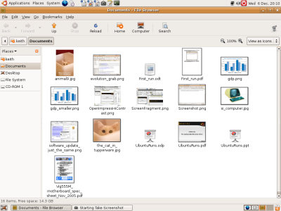
ubuntu file manager window showing thumbnails

I’ve put Ubuntu 6.06 back on the old Dell L400 laptop (Pentium 3 Coppermine with 256Mb of ram, a 12 inch 1024 by 768 screen that is bright and contrasy, a battery that lasts about 20 minutes and one USB port).

This version seems to run better than 5.04 and 5.10, and the ACPI fan and temperature problems I had earlier have been resolved. I still think Linux is a geek thing, I don’t think the desktop is ready for a typical end user. Just have a look at the howto to get connected to Orange ADSL broadband using the Thomson SpeedTouch USB modem. The instructions work true enough but you have to know that all UK ISPs use PPP over ATM, and that the VP/VC values for all UK service providers are 0.38. You also have to work out that the ‘username’ needed in the scripts is the Orange/Wanadoo/Freeserve username but with the @fs on the end.

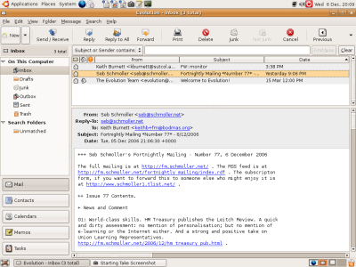
Evolution e-mail package has similarities with MS Outlook

Installing Flash player 7 so that you can watch YouTube screencasts takes a bit of doing as well – and I will need to sort the sound and get screencasting with commentary going.

Then I have this crazy idea of buying an Intel Celeron D box for around £200 and a lovely 20 inch screen for around another £200 and surfing and writing handouts with Open Source software. The iBook is there as a safety net.

Note to self: Java with Firefox 1.5
sudo apt-get install sun-java5-jre
sudo apt-get install sun-java5-plugin

Yup, that’s right, first you install the Java Run Time Environment from Sun (80+ Mb), and to do that you have to have Universe and Multiverse repositories active as you will have if you have installed Flash Player. Then you need to install the plug in stub for Firefox.

Previous posts about Ubuntu.

48 things to do with an interactive whiteboard

December 6th, 2006

You can find a list of 48 things to do with an interactive whiteboard compiled by colleagues at the North West JISC Regional Support Centre.

Just in case of bit rot and web server changes, I have taken the liberty of copying the list at the end of this article – it is the work of other people! Compiled by Helen Walmsley, RSC Northwest, from ideas submitted by ILT Champions

Exercise for the reader :: how many of these activities could still work just with a projector? What actually is the ‘value added’ of an interactive whiteboard bearing in mind that it adds £1200 to £1400 onto the cost of a projector and networked PC (around £1400 depending on installation cost)? What I am saying is that in FE we have limited budgets and I can almost get two classrooms with networked PCs and projectors for the cost of one room with the full monty.

The list follows….

Using an Interactive Whiteboard in the presentation stage of a lesson

1. Demonstrate chemical reactions by moving molecules around… I set up pictures of a benzene ring, a methyl group & three nitrate groups… (Set up as Word images, just drag them into view from ‘off screen’ as they are required.)

2. Our Foundation Skills Department used theirs as a karaoke machine screen for their Christmas Party last year. As you can imagine, great fun was had by all!

3. I would use the whiteboard to help me present just what the students will be doing, so helping me to demonstrate.

4. Good for explanations to learners with a very low level of literacy

5. It can take a picture of the screen which can be useful.

6. To present the aims and objectives of lesson

7. Present hyperlinks to files/internet pages of new material

8. Use the Multimedia features – play music, video, pod cast, radio etc

Using an Interactive Whiteboard in the closed practice stage of a lesson

9. Try ‘Who Wants to be a Millionaire’ (the famous PowerPoint version) or Blockbusters

10. In a beginners IT class or E1 class to demonstrate how to use basic functions, such as log on, open Word, and basic functions within word.

11. Presenting new (foreign) language

12. Demonstrate phonic blends, digraphs, suffixes prefixes etc using different colours and grammar and tense examples in similar way

13. Checking answers off worksheet instead of OHP, more accessible in class – can go through points and not have to rub them off unlike usual white board

14. Cloze exercises

15. Introduce sequencing of actions/information

16. Demonstrate particular steps, sites, strategies, hints etc. to groups

17. Look at spreadsheets together and show how to manipulate data

18. A Childcare teacher prepares slides in the notebook with just headings on them (a good aide-memoir); she then adds the teaching points as discussion develops in the session and saves the whole sequence to print or publish on the VLE.

19. Teachers here who work with student with learning difficulties are very fond of displaying Quia activities on the Smartboard. The students like to come out and touch the board.

20. Get a picture showing the usual colour combinations (red green blue overlapping) e.g. from: http://display.engin.brown.edu/Engin_Main/Colors/colors_english.htm Borrow from physics department polarising filters, hold in different parts and rotate (keeping filter parallel to screen). Try this in the 3 primary colours and ask students to predict what will be seen in the others.

21. Drag and Drop Exercises – create something like a flowchart in PowerPoint, create text boxes with the ‘answers’ and position these to one side of the diagram, then during the session run the presentation in editing mode rather than presentation mode, and drag the boxes into the correct positions as you teach.

22. For Hair and Beauty see: http://www.ukhairdressers.com/New_makeover/index.asp Also works with personal care (Business Admin) and self awareness (Foundation)

23. Any one of these http://www.bmesonline.com/interactives.htm can be turned into an interactive learning episode (phew) for Caterers, Early Years students, Health and Social Care, foundation – you tell me. Oh and don’t forget any number of the NLN materials can be used effectively with an Interactive Whiteboard

24. Let the learners decide how to use the board (after you’ve shown them the ‘stuff’ of course).

25. Work through examples together

26. Demonstrations of experiments (using Crocodile Clips http://www.crocodile-clips.com/index.htm for example)

27. Create quizzes with Hot Potatoes, drop down in Word, etc

28. Cover an image in Word with filled rectangles. Add a question to each rectangle and the student who answers the question gets to remove the rectangle on the screen. Gradually the image will be revealed.

29. Students create quizzes and present on the board for each other

30. Work together on organising ideas in text boxes in Word by moving them around the page until they are in the best structure.

31. Student presentations of work
Using an Interactive Whiteboard in the open practice stage of a lesson

32. Good for putting up students ideas while class is going on

33. Using a gyroscopic mouse the teacher can be in with the learners and get them interact without leaving the desk. Thus ensuring that everyone is involved.

34. Display a summary of task

35. Display useful information required for the activity

36. Display reference material

37. Display previous lessons

38. Display a clock with timings for the activity

39. Play relaxing (or motivational) music or images whilst students work
Using an Interactive Whiteboard in the plenary stage of a lesson

40. Pass round a wireless keyboard and students add ideas to the board

41. Display a summary of the learning

42. Save objects you have created on the board

43. For disabled learners (and many others) the ability to record the key points of lessons frees them up to concentrate on participation rather than note taking. If using the IWB encourages more multimodal lessons with discussion, collaboration, movement etc then it can only be a good thing for everyone.

44. Mind mapping – a tutor got special needs students to do a mind map using it to redesign an animal care area using their own handwriting so showing the group contributed to the discussion (good one for all you key skills people out there ).

45. Use PowerPoint to enable students to make presentations.

46. Interactive voting

47. Quiz/game

48. Save lessons to VLE/intranet

Compiled by Helen Walmsley, RSC Northwest, from ideas submitted by ILT Champions. www.rsc-northwest.ac.uk

Photos now on Flickr

December 3rd, 2006

Warning light fazeley stSpray Can Custard FactoryWall of crushed carsThe Red Blob

My Flickr gallery now stores the photos – I like the instant resizing that is possible. The Kodak EasyShare C310 reminds me a bit of a Kodak Instamatic – slightly fuzzy images even though the camera runs to 4 Mega Pixels (I’d rather have a sharp 1024 by 768 image, but I’ll have to buy a more expensive camera to get that). Still, it does what it says on the box.

Kodak Instamatic

I’m using the Kodak C310 with a 256 Mb SD card and that gives me 300+ images. The camera is very easy to use and seems to acquire images quickly. I like the clear menu and the facility to turn off the LCD display and use the viewfinder.

How to write quickly

December 1st, 2006

“Part of it is tenacity. For example, I am writing this item as I wait for the internet to start working again in the Joburg airport departures area. But part of it is a simple strategy for writing you essays and articles quickly and expertly, a strategy that allows you to plan your entire essay as you write it, and thus to allow you to make your first draft your final draft. This article describes that strategy.”

The second paragraph above acts as a summary of the whole piece. Downes claims that discursive writing can be classified (it seems to be a week for classifications) into four categories;

  • Argument: convinces someone of something
  • Explanation: tells why something happened instead of something else
  • Definition: states what a word or concept means
  • Description: identifies properties or qualities of things

I shall leave you to spend the next half an hour reading his words…

Other pages on writing include