Writing about charts
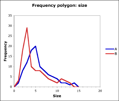
I used an Excel spreadsheet with hotlinked graphs on a projector. Two contrasting frequency polygons led discussion about location (central tendency) and dispersion (spread). As both frequency tables had totals of 100, we could explore the idea that a lower peak means more data in the bins on either side of the peak, and so a more spread out distribution. As the graphs are hotlinked, I could alter frequencies hugely to make points. After plotting polygons based on student data, we looked at constructing a cumulative frequency curve.
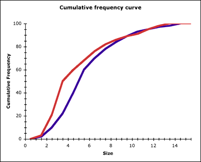
Then I projected the cumulative frequency curves drawn from the same frequency distributions used for the polygons. Students had a handout showing all four charts, and we explored the relationship between the sharpness of the peaks on the frequency polygons and the steepness of the gradient on the cumulative frequency curve. This latter point sunk home for one student while plotting the cumulative frequency curve (psychomotor learning or the need for practical action on data?). Later work on interquartile range will reveal the difference in spread between the two distributions. It would probably have been a good idea to force the horizontal scales to match on the projected graphs and on the handouts.
A simple resource that takes minutes to make – no fancy PowerPoints with transition effects – supports two 15 to 20 minute discussions and allows instant follow-up to student questions.