
[ home ]
GCSE Maths students find writing about charts hard work. A discussion based activity came to mind where each group had to discuss a chart, write some sentences, then compare the sentences they wrote. As a further slightly devious twist, each group would have a different chart from the group next to them.
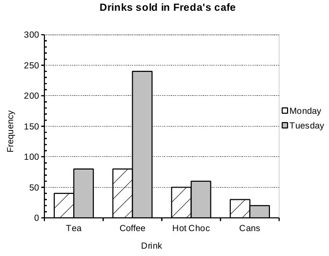
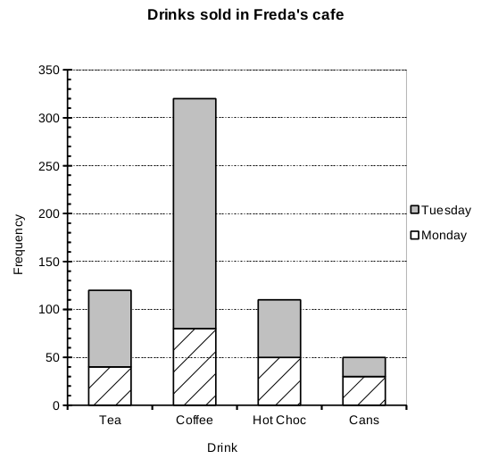
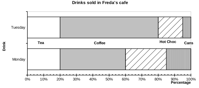
I used a spreadsheet to generate three different types of chart from the same (made up) data. The fabricated data has certain easily spotted proportional relationships, and tells a simple story of low trade on Mondays in Freda's tea stall.
Charts were coloured using a greyscale palette so they can be printed in monochrome. The images below should copy and paste into most of the interactive whiteboard packages and into PowerPoint or Impress for class discussion after the group activity.
Each group of about 3 students had copies of a handout showing one of the three types of chart. The handout asked them to write a few sentences about what the chart told them, and to try to use keywords in their sentences. The group was asked to polish up one of their sentences to present to the rest of the group.
The percentage bar chart should be given to the group with students you want to 'stretch and challenge' in the OFSTED jargon - they don't know about the absolute numbers of drinks sold, and they will need to formulate sentences about changes in percentage.
I found that I had to do a lot of coaching to get students to compare proportions and to use fraction language, to estimate fractions and ratios between aspects of the data.
I had mini whiteboards out for the groups to write the 'polished' sentences on. The groups rotated their mini-whiteboards (usually about 6 or 7 groups) and commented on the other sentences. Groups then saw the charts the other groups had.
Some sentences were picked out and written up on the whiteboard.
Students had chart interpretation questions from the AQA Practice Sets as homework, and generally did well. I think this 45 minute activity covered basic chart reading and gave students practice in writing sentences about maths in a way that allowed coaching for those new to graph work, and that allowed a degree of challenge for those familiar with it.
We also compared tea stalls, cafes and catering generally in the local area. I deliberately mixed up the groups so as to have people who had not worked together much in each group. Social factors can help making people more comfortable in Maths lessons.
Keith Burnett, Last update: Sun Dec 15 2013