Pie charts
Both GCSE and Access Maths are moving into basic charts – and there is also coursework that requires students to write about what the graphs mean. I had a laptop and projector set up with Excel running. I typed in some data for a pie chart – and used the Chart Wizard to draw the chart. The students drew a chart based on the same data and compared their drawings with the projected image – caught a few mistakes that way while I went around and helped position the protractors.
Then I asked questions about the relative sizes of the sectors – is this sector twice the size of that one or nearer three times the size? – Which sector is the largest? How big is the second largest in relation to the largest; half the size? a quarter of the size? Guess the percentages in each sector! Finally, I had data with two columns and asked students to compare the relative proportions or percentages of each sector. I then used the Chart Wizard to redraw the graphs as a comparative percentage bar chart – much easier!
All this could have been accomplished with handouts, OHPs, PowerPoint presentations or sketches on the whiteboard but using Excel interactively saved a shed load of time and allowed me to alter the data on the fly and answer questions with examples.
The Shodor Foundation makes a range of interactive Java applets available for use from their Web server (no download for Intranets alas)
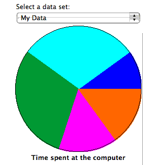
- Type your data in and plot the result Java applet – type your numbers and the labels and the applet plots the results. Could replace Excel in the activity above
- Fractions and percentage draggable pie chart Java applet – you drag sliders to change proportions or drag the ‘handles’ on the sectors to change the angles
- Other statistics applets from the site