Dynamic graphs
The R statistical computation environment is available for free download and is compiled in versions for Mac OS X, Windows and various flavours of Linux.
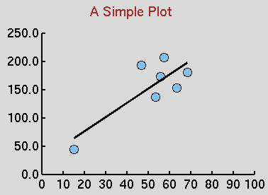
Dong-Yun Kim has provided a ‘getting started’ tutorial for R and the tutorial shows an interesting demo in TCL/TK. A scatter diagram is presented in which you can drag the data points to see the effect on the ‘line of best fit’. My example above shows how a cluster of data points with one pathological point can give a ‘line of best fit’ of almost any slope you want according to the pathological data point coordinates!
I can imagine using a hacked version of this demo (larger canvas, relevant data set) to emphasise the need to plot data before running statistical analyses.
To see this tutorial using the Mac OS version of R, you need to click the X11 toolbar button as the tcl/tk script interpreter needs the X11 window manager to be able to draw graphics to the screen. Then you issue the R commands…> library(tcltk) > demo(tkcanvas)
and the scatter diagram window with draggable points appears.
Static graphics are displayed within the Aqua window manager (i.e. Mac OS X) and can be copied and pasted into Preview as PDF files -zoomable and no jagged edges.
Alas, one ‘feature’ of the Mac OS X implementation of R appears to be that the data frame editor does not allow variable names to be edited. More exploration is needed. R may be a little too intimidating for HND first year students, but it is free and can run all the statistical tests they will need. MS Excel has known issues for statistics, and the Office 2007 version for Mac OS X will not include VBA, which, presumably, means no Analysis Toolpack Add-in.